Good packaging design catches the eye – but also the imagination. Artwork, shape, material and size all make a big difference when it comes to packaging, and achieving harmony in your design between all of these elements – and your brand – is key to achieve an effective package.
We’ve written elsewhere about why packaging design makes such a difference to the fate of the product. Fundamentally, it’s because good packaging converts people into customers: a great box really can make all the difference to a consumer’s decision-making process.
That’s why we pride ourselves at Squibble on delivering great packaging design for our clients. We achieve this by understanding each client and their product individually – because the best designs are ones that are closely aligning with a brand and its values. Drop us a line about our process if you’re interested to know more – but some of the basics we’ll include below.
What Makes Packaging Attractive?
We could response to this question, “What makes anything attractive?” Beauty is in the eye of beholder – attractiveness is subjective. Companies and brands should acknowledge this, and do the work necessary to understand who their customers are – and therefore what is attractive to them. This is branding 101 – but since packaging is part of a brand, customer profiles are key to this area of design, too.
Tastes differ across demographics and market segments. Still, there are certain aspects of packaging design that should be addressed when designing a new piece of packaging for any one of them. Taking each of these in turn – and matching them to the appropriate customer profile – should result in success.
Shape is about physical form, of course: what does the packaging look like? Is it angular or curved, tall or squat? Then comes material: is it glass or cardboard, plastic or wood? Within those materials, what level of quality should be adopted – what’s the handfeel? Next is artwork: the imagery and typography to choose. Much of this will be dictated by the parent brand, of course – but there is still room for creativity.
How Do You Make Packaging Stand Out?
Shape, material and artwork are critical, of course, because if each are attended to correctly they will help the packaging “stand out”. But what does this mean, and how is it achieved, specifically?
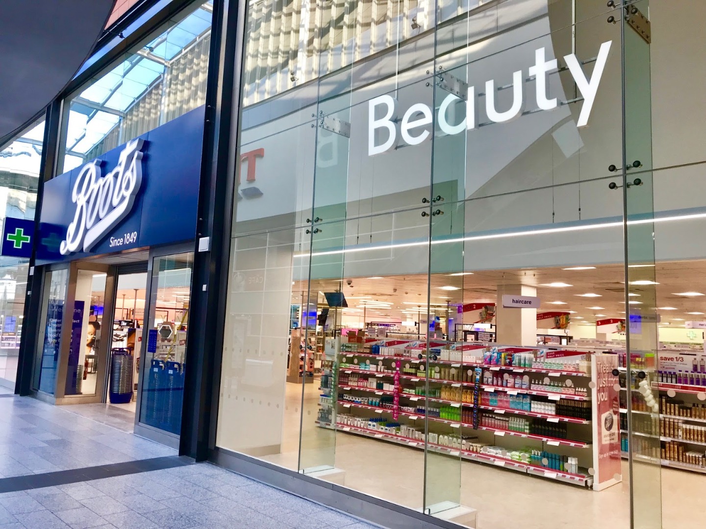
Designers often talk about “shelf impact” to describe the quality that packaging needs to have if it is to stand out in store – or indeed online. The key aim here is distinctiveness: clever packaging exhibits the qualities an audience wants to see in the product’s sector of the market, but in a way which has not been done before.
By aligning shape, material and artwork in a new way, brands can achieve very distinctive results: perhaps different colours or typefaces will help a new shape of package stand out from all those other cans of soup? Or maybe a product should stick to a tried and tested shape but switch the material? Often, of course, all that’s needed is a bold visual flair.
What Are The Characteristics of Good Packaging?
If distinctiveness is one of the key characteristics of good packaging, it is not the only one. While that “shelf impact” is critical if a given product is to hold its own in the ruthless retail space, packaging needs to do more than just grab the attention.
First and foremost, it needs to serve its function. The prettiest package in the world is useless if it cannot hold, protect and preserve the product it contains. Do not overlook the importance of functionality and usability: is the package easy to pick up and open? Can it be resealed? These things really matter.
Secondly, consider clarity. The best packaging is simply and refined: it announces what the product is, and then gets out of the way. Cluttered labels confuse; overly designed shapes are unnecessary and can repel consumers who wonder how on earth it might work. Distinctiveness is great, but don’t package bleach in something that looks like a soda bottle – it won’t help anyone.
Third, be authentic. This means that your package shouldn’t lie – don’t make it bigger than the product, or include photographs that look different to what’s inside the box. Setting up expectations that aren’t then met is the opposite of a wise sales strategy: good brands and packaging inspire loyalty, and honesty is an important element of that relationship.
So there you have it: package design 101. A great package will be attractive but usable, distinctive but clear. It will unite form and function in such a way that the product inside grabs an audience’s attention – and does not let go. Catching the eye and then holding it: that’s what makes good packaging design.


