A big part of what we do, at the beginning of any web or branding project, is project discovery.
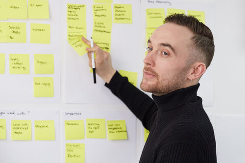
We hold face to face session with key stakeholders to understand how the business operates and how they interact with customers. We do this to make sure we understand how the website should work and where we should focus our efforts to make improvements.
We have a set method in which we deliver this. It’s designed in such a way that encourages conversation and enables perceptions to be challenged. The goal at the end of the session is to be able to answer a range of questions.
Generally they look like this:
- What’s the brand story? (The why you do it?)
- What’s your Approach?
- Competitors? (Whats the landscape look like?)
- Future Plans (+5 years 2025)
- Key message x 3
Today, we delivered our first discovery session via conferencing facilities. Here’s what we had to replicate: the ability to stick post-it notes up and sketch out layouts on paper (otherwise known as wire-framing). All with participants having visibility on what we’re doing in real-time.
Here’s what we chose:
Zoom – For video conferencing. As this is quite a personal session we needed to be able to see each other, I felt face-to-face interaction was still a must
Idea Flip – A simple yet collaborative tool that enabled us to access a live version and see instant updates, as I typed. So we could add post-it notes like any other session
Figma – With a live link all participants were able to see the wireframes we were creating as we went

A fairly lightweight bunch of tools but they truly enabled us to carry out our discovery session as if we were all in the room together.
We started by adding our thoughts to virtual post-it notes via the Idea Flip web application. We could even start adding tasks down the side, as a reminder once the session was finished. I was able to export the board and share with everyone too.
After we had completed our initial brainstorming we moved into Figma. I’d started to explore the idea of using this software but hadn’t really felt the need to change our toolkit. This gave us the perfect excuse to start though. Another web app in the cloud meant that all our actions were shared in real-time.

Feedback and thoughts
Laura, our client, felt that it enabled us to “spend more time focussing on the structure of each page” and provide instant and valuable feedback to help steer the direction. Laura also added that it was “really good to see the pages coming to life before her”.
During todays session we have been able to create a truly collaborative experience. I hope this post is useful to others within the design industry and if you have any questions just get in touch: kj@squibble.web-build-dev.co.uk.


