Stand-out graphics
Equilibrium, like many companies in the cyber sector, wanted to differentiate themselves from the competition. In our initial “look and feel” session, we suggested pushing the boundaries of the sector’s design norms, and Equilibrium was all for it. To achieve this, we created bespoke hand-drawn illustrations that are used on their website and marketing materials. These illustrations are completely unique and work harmoniously with the accompanying text block to create an unforgettable visual experience.
- Branding, Website, UI
- Tech, IT & SAAS
- Marketing Executive
- 3 Month Turnaround
Easy-to-edit backend
We built a custom website that lets the Marketing Exec take full control and make updates to improve SEO. No more waiting for developers to make changes - take charge of your online presence!
Efficiency leading
Equilibrium relied on our project management expertise to reduce the stress of managing a web design project, particularly for sole marketers tasked with producing additional content. We provide regular feedback and status updates to keep everything on track.
Uncovering hidden gems
At the beginning of each project, we immerse ourselves in the world of our clients and their customers to truly understand their needs.
Assets with personality
Cybersecurity websites are notorious for their uninspired designs, featuring dark-hooded figures and endless lines of code. But Equilibrium is not your typical cybersecurity team. With a focus on expertise and friendly customer service, they wanted their website to reflect their unique personality and stand out from the crowd. We created bespoke, hand-drawn assets that burst with color and intricate details, perfectly showcasing the personable approach they bring to their services. Say goodbye to stale designs and hello to a website that truly reflects your brand!
Wireframes to design
At the heart of every website design project is the user journey, and we don’t take that lightly. Equilibrium knew what they wanted to say, but they needed help figuring out how to say it. That’s where we came in, creating wireframes to guide their content ideas and bring them to life with bespoke hand-drawn assets and bold colours. Our collaborative approach ensured that the final product was not only visually stunning but also met the needs of the user journey.
Complete autonomy
We believe in giving our clients complete control over their websites. That’s why we provided Equilibrium with a user-friendly content management system, so they can make any necessary changes whenever they want, without having to rely on developers. But we didn’t stop at that, we also provided comprehensive website training to ensure that they had the knowledge and skills to make the changes they needed. Of course, we’re always here to help if they need us – just a quick email away!

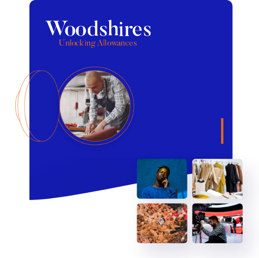
Woodshires
Web DesignView next project
Squibble's creative design and custom WordPress site brought Woodshires' website to life with added hand-drawn assets for brand personality. Their blog content was made easy to add, allowing for a seamless user experience.
 Show me more

View next project
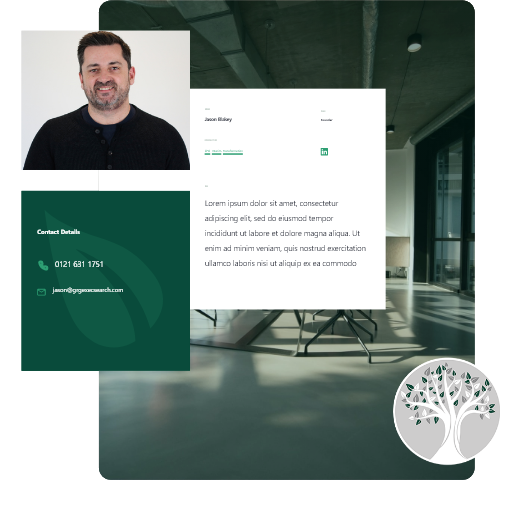
GRG Executive Search's WordPress site was integrated with their job management board API for seamless functionality. The site aligns with the brand identity and offers full control to make content changes.
 Show me more

View next project
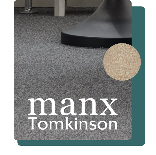
Teaming up with Squibble has allowed MANX to take full advantage of the benefits that come with an extended team, with Squibble taking full ownership of the website project. This has taken the pressure off MANX's internal team, allowing them to focus on marketing efforts and ensuring a successful launch. Squibble's technical expertise and custom designs based on user research have also provided MANX with a unique and lasting website that perfectly fits their customers' needs.
 Show me more
Ready to make your mark?
"*" indicates required fields
