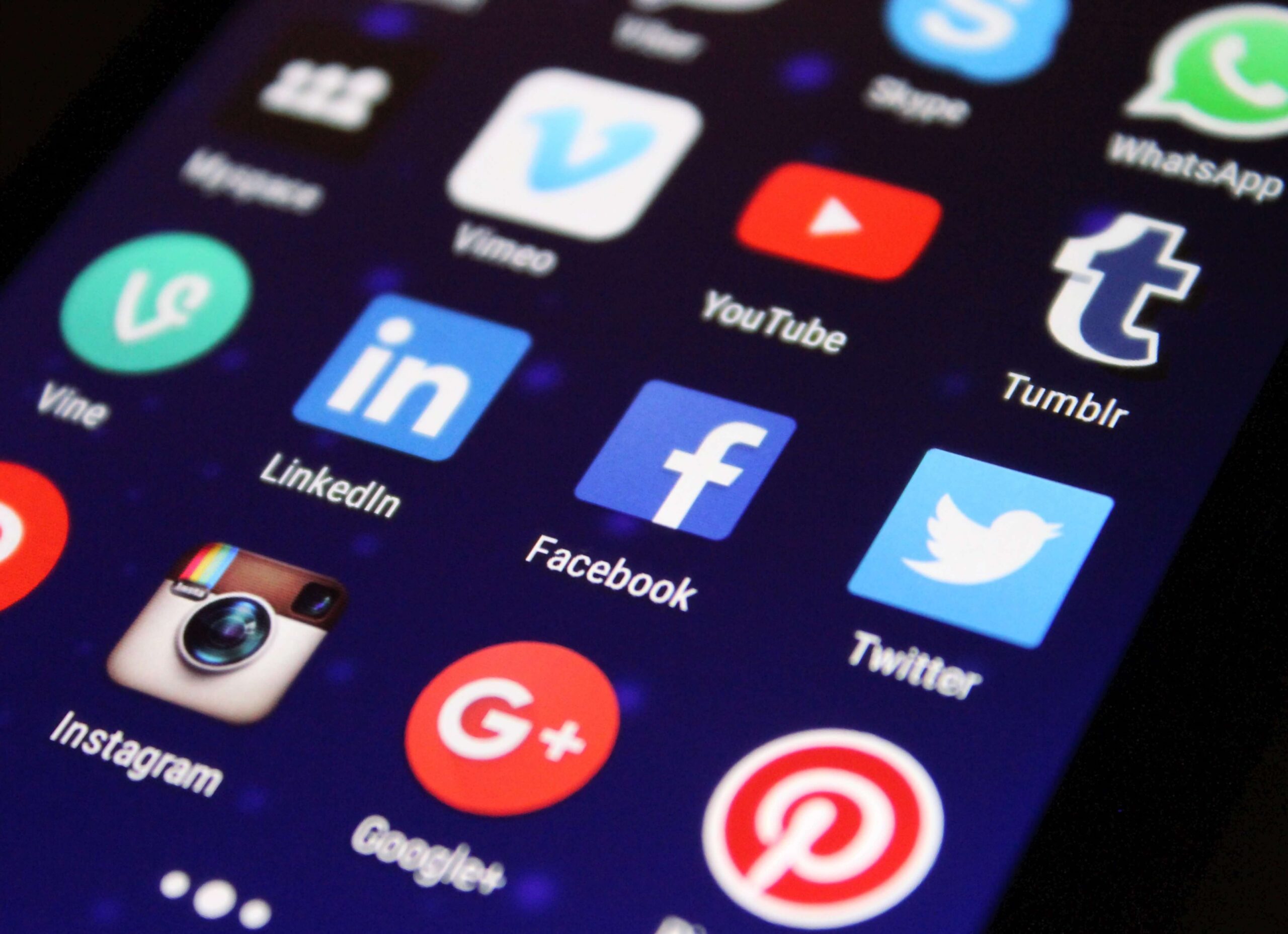
Most people creating a new website will ask me at some point where the social media buttons will go. But is sticking the same tired and gaudy social buttons on every page of our new website really the best way? Here’s why we don’t think so.
Distraction
When creating a website it’s considered best practice for each page to have one clearly defined goal. That could be anything from adding a product to the basket, signing up for a newsletter, subscribing to a blog, watching a video, filling in a contact form or clicking through for more information. Unless the page is specifically focused on gaining new social shares, the social badges may just be distracting people from your true conversion target.
Style
The standard social buttons are made using another company’s branding. They can look ugly and detract from your own website’s carefully considered design. They take up important white space and can make pages look cluttered. There’s always a limited amount of premium space on a web page. Is asking for social shares really the best use of this space?
When your visitors click these sharing buttons they’re often faced with difficult to use pop-ups, oddly formatted text and marketing jargon – you lose all control over your company’s image. Plus, with the increasing use of mobiles and tablets these buttons are becoming more and more irrelevant. In fact, one study by Moovweb showed only 0.2% of users ever click on a mobile sharing button.
Credibility
Asking your site visitors to share every single page can appear needy, lazy and confusing. Your terms and conditions, your contact page, your FAQs – do all of these really need sharing? The confusion of the message causes people to see the buttons as background noise – blindly pasted onto every page. A few specific, targeted requests will likely perform much better.
E-commerce, niche or specialist sites and informative sites often find that social buttons detract from their messages. Professionalism, credibility and performance can all be damaged. These third party badges often take a long time to load, plus if many of your pages show very few shares this can have a negative influence on your image and credibility, actually discouraging people from sharing your content.
Timing is Everything
It’s time we started thinking more carefully about how, when and why we ask people to share our content. Rather than asking people whilst we try to secure a sale, try adding the share message to your checkout or thankyou page along with an incentive for extra information or discount.
Alternatively, choose specific pages of your site to include the share requests on – blog style content is usually more share friendly than static pages. Some sites include the share function on specific pop-out quotes or attached to a suggested discussion topic. Many people still prefer to copy the link and share themselves though, as it offers more functionality, better control and a more accurate preview of the message.
The reality is if your site is functional, well designed and full of valuable content people will want to share it and missing social buttons definitely won’t stop them.


