A bold look for tax consultants.
The world of accountancy branding has a common aesthetic.
It tends toward the grey and self-serious end of the spectrum. And yet, the teams at these companies are often full of personality. That’s what we found when working with the senior team at Woodshires. So, we put that personality on the page.
- Web Design
- B2B
- MD
- 2 Month Turnaround
Engaging web design
With a world full of numbers, we introduced colour and creative assets to what was considered a boring website design and really brought it to life.
Blog writing
As avid blog writers, Woodshires wanted the ability to easily add blog content to the website. SO that's exactly what we gave them with their custom WordPress site.
Custom assets
Giving the brand personality, we created some hand-drawn assets for them to use across their marketing materials - you know, to show off a little!
Showing range
The team works with clients across a huge number of sectors, helping them to efficiently manage their tax. This range of expertise had to be captured on the website. Our solution? A custom-built case study section to showcase projects. And they have adaptable CTAs that can be super targeted – an effective tool for turning website visitors into clients.
Unlocking a world of colour
If you’re going to do something completely new, it should feel right. Looking at Woodshires existing branding, we found a bold shade of blue nestled in their logo. It was a perfect foundation for the new website. We worked closely with the team to draw out the colour and find the balance between professional and bold.
Simple organisation tools
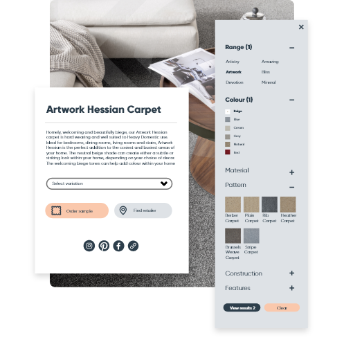
After talking to the sales team and carefully plotting the user journey, we created a custom filter for searching Kingsmead’s carpet collections. The previous system was based on ranges, but with 80-plus ranges it gets very tricky for customers to navigate. Filters like colour and material now help customers narrow their choices before ordering a sample. An API connects to the Kingsmead HQ to fulfil the orders.

View next project
Squibble updated Kingsmead Carpets' website to match their branding, improving their market position and making content creation easier. They also integrated a custom API to streamline the order-fulfillment process.
 Show me more

View next project
Turing Scheme trusted Squibble to handle their secure government data with reliable backups and updates. Squibble provided the marketing department with full CMS control using WordPress, while collaborating with the client to meet their project goals.
 Show me more

View next project
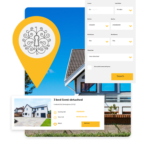
Squibble provided Under the Hammer with a fully custom web build, making property buying simple. They also developed a custom API to connect to the client's order-fulfillment system for a seamless customer experience.
 Show me more
Ready to make your mark?
"*" indicates required fields
